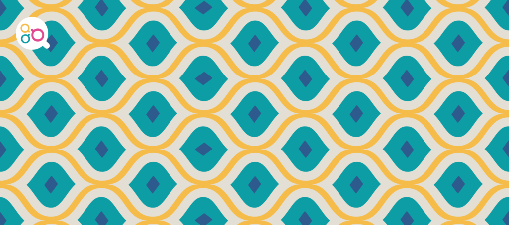

What does your brand identity have in common with patterned wallpaper?
If you put up some wallpaper and it’s got a clear pattern on it – let’s say diamonds – and you don’t line up each piece carefully, the disjoin will be obvious. Your eye will be drawn to your wall every time you sit down in that room, and it will stick out like a sore thumb. Alignment is just as important in a logo, and if it isn’t right your customers WILL notice. So, how do you create a logo that is fit-for-purpose and looks right everywhere you use it? In this blog, I’ll show you how to create a logo that works in the real world.
What goes into making a logo?
There are several different types of logo, but they are all made up of a combination of the following design elements.
- Icon/symbol
- Tagline
- Typeface
- Colour palette
Consider Apple‘s logo. This is a good example of a logo that uses just an icon, and with it they have successfully created worldwide brand recognition. Google, on the other hand, opted for two design elements – a typeface and a distinctive colour palette.
When you start to expand beyond this with a combination of different elements, for example, an icon or symbol + a ‘wordmark’ (like Google) + a tagline, then you need to consider carefully how these moving parts fit together as a whole.
Aligning the design elements
When looking at your logo and how you use icons, symbols, or a tagline, it is not quite as easy as lining up the pattern on the wallpaper. You need to align the different elements in a way that creates something proportionate and balanced. Take my brand identity for ‘Make A Brew’ – it’s made up of:
- a symbol (three cups)
- the words ‘make a brew’
I use my logo in its landscape format most of the time, so the cups are on the left-hand side and the words ‘make a brew’ are on the right, with my tagline underneath lined up to the edges of the words above. This is purposeful, but it’s also flexible so I can change the order and position of these elements when I need to (more on this later).
When you, or your designer, are deciding how to line up the symbol/icon with the words in your logo, you need to think about how the whole thing will hang together. In the example below for Forge & Sculpture, I’ve shown three different options for aligning the symbol and the words.
- Position the symbol on the left with the words next to it on the same line
- Centre the symbol with the words underneath so there is equal space either side
- Balance the symbol with the words on the right over two lines
Getting the balance right is not as easy as lining up patterns on wallpaper, but you will get a feel for whether it’s right or not. If it doesn’t feel right, then try another option until you’re happy that you’ve achieved something that reflects your brand identity.
Keeping your logo flexible
Extending your brand identity
You should always try to use the same design elements whenever you’re creating anything visual for your business. Take for example, the branded image. This is an image/photo combined with a typeface, colours, and business name, like the example below from Forge and Sculpture.
A branded image is a creative and engaging way of getting across information to your followers and readers. Keep in mind that when you share something on your social channels, it has the potential to be seen by more than just your own followers. By consistently using recognisable elements from your brand identity, you are helping to build brand awareness in your market place.
Why does all this matter?
Consistency is key to building a brand. Your visual identity should represent your business in a strong, clear way that speaks to your target market. Every time you use your logo – or any of its design elements – you are reinforcing your company’s voice. It needs to be consistent, no matter where you use it or in what context.
Whether you’re creating your own logo or working with a designer, always remember to:
- be clear on your chosen typeface, colours, icons/symbols
- ask for multiple formats so you can apply it in different ways
- make sure you have a copy of it as a vector image
- use the design elements consistently when you’re creating anything visual
Whether your target audience is seeing your brand on social media, on your website, on a promotional gift, in print, in an email or at an exhibition… your brand should be instantly recognisable.
Remember, if it doesn’t look quite right, then your customers will notice. If you’re looking for help with your brand identity, contact me. Let’s have a brew, and chat about how we can work together to create the right visual representation for your business.